Beware the Bad Infographic

When they’re good, infographics help communicate complex messages in a way that’s easy to grasp and share. When they’re bad, they confuse, frustrate – and are just downright scary! Take a look at what we mean.

EEEK! Bad design kills a potentially helpful infographic.

Bad design infographic

The overall concept has some potential but unfortunately, the flat color scheme and ugly, amateurish images fail to represent the information in a compelling way. The Signal team says this one’s a FAIL.

YIKES! Have you ever seen anything so confusing?

Confusing Infographic

This infographic is so busy that it hurts to look at it. It has fallen prey to being completely overloaded, which means readers will lose attention fast. It’s also makes the content harder to understand, not easier – defeating the purpose of the visual.

WHOA! Boring and unnecessary make a bad combination.

Boring Infographics

This infographic is both dull and gratuitous. Text or a simple chart would have been more effective in this case. Remember, visuals need to serve a purpose. And let’s face it: the eyes are also a little creepy.

Now, make yours good.

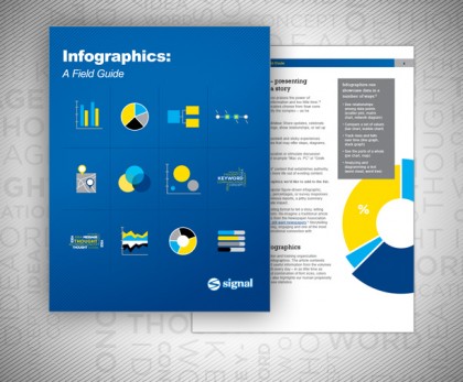
So, what makes an effective infographic? We discuss this and much more in our new white paper, Infographics: A Field Guide. A crack team of our writers, designers, and programmers pooled their expertise to create a great resource that helps you answer the following questions:

  • What the basic building blocks of infographics?
  • How can you use infographics to most effectively communicate your message?
  • Why do people like infographics?
  • What are pitfalls to avoid?
  • What’s a “crap circle?”
  • What are the keys to success when using infographics?
Avoid the BAD infographic. Read our white paper today!

Image credits: First and third, via KlientBoost, second via worstinfographic.

Thinking Beyond PowerPoint A Marketer’s Guide

A well-crafted business presentation can persuade your employees to support a new strategy – or your customers to buy your product. It pays to spend time looking at how you’ll showcase your messages and stories. At Signal, we help our clients create high-end presentations. And we often get asked about the differences between the three major presentation platforms – PowerPoint, Prezi, and custom browser-based solutions. Here are three easy steps to help you decide which solution is right for you.


Step 1: Know your advanced alternatives.

PowerPoint is the classic presentation package that has become the corporate standard. Even though it has a reputation for being a bit humdrum, it’s entirely possible for PowerPoint presentations to be creative and compelling. They just need a professional design touch to avoid those “bad PowerPoint” pitfalls. But when you need to take your presentation to the next level, today there are new options.

Prezi is an online (cloud-based) presentation and storytelling tool that uses a single canvas instead of slides. Prezi’s zooming user interface, or ZUI, lets users pan and zoom through the virtual canvas, offering a new way to emphasize ideas and show relationships. This great example transcends bullet points to create an effect that’s similar to kinetic typography, or animated moving text.

Browser-based presentations tell a story within your browser window, using tools such as HTML5, Javascript, CSS, and video to create customized, interactive user experiences. HTML5, in particular, is a step up from the limited functionality of basic HTML. It offers consistency across devices, fast navigation, and a more seamless, modern look. This Citi microsite is an awesome example. And this John Deere site, designed by Signal, showcases how a custom presentation can wow visitors.


Step 2: Consider the pros and cons.

What are the usability and logistical implications involved in choosing these advanced alternatives to PowerPoint? Take a look at the pros and cons of Prezi and browser-based presentations.

Presentation Pros Cons
Prezi
  • Some users already familiar with it
  • User training is part of the software
  • More cost-effective than HTML5, due to lack of coding
  • Faster creation time than HTML5
  • Can be downloaded to a device like an iPad, and run on a Prezi app
  • Limited design and functionality based on built-in Prezi controls/features
  • Users must save new versions when they make revisions – the lack of built-in version control can cause confusion
Custom browser-based presentations
  • More robust design, functionality and content options than Prezi
  • Better user experience on web-based platforms
  • CMS-based tool means no version control issues
  • Training / agency assistance required to create presentations in this format
  • Requires hosting on a web-based server
  • Can be used without an internet connection, but not as “clean” as Prezi (files must be installed and not just run on an app)
  • CMS coding/development means it takes longer to create a presentation
  • Less cost-effective than Prezi


Step 3: Present yourself with the right questions.

All three platforms allow you to incorporate text, graphs, images, sound, and video – but there are differences in basic functionality. What works best for your needs? Ask yourself these questions:

Thinking Beyond PowerPoint


We hope that you found our guide to be helpful. Remember, sticking to PowerPoint doesn’t mean you can’t breathe new life into your presentation! There are also a lot of new directions you can take beyond PowerPoint to deliver your message in creative and compelling ways. If you’d like to discuss your options in more detail, please feel free to get in touch.