When they’re good, infographics help communicate complex messages in a way that’s easy to grasp and share. When they’re bad, they confuse, frustrate – and are just downright scary! Take a look at what we mean.
EEEK! Bad design kills a potentially helpful infographic.

The overall concept has some potential but unfortunately, the flat color scheme and ugly, amateurish images fail to represent the information in a compelling way. The Signal team says this one’s a FAIL.
YIKES! Have you ever seen anything so confusing?
This infographic is so busy that it hurts to look at it. It has fallen prey to being completely overloaded, which means readers will lose attention fast. It’s also makes the content harder to understand, not easier – defeating the purpose of the visual.
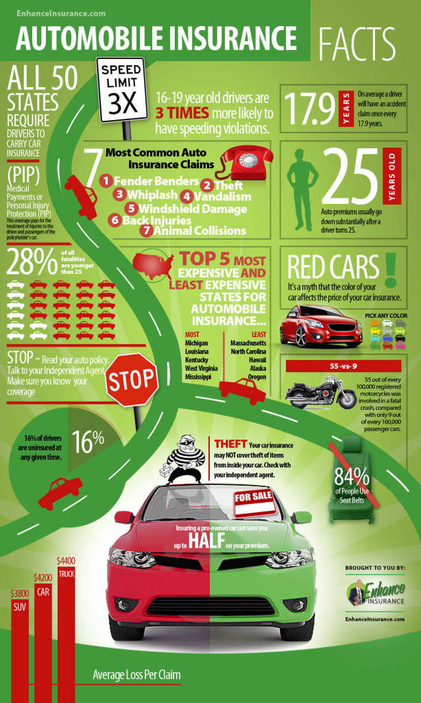
WHOA! Boring and unnecessary make a bad combination.
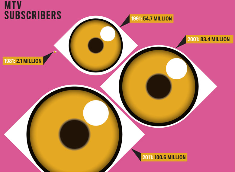
This infographic is both dull and gratuitous. Text or a simple chart would have been more effective in this case. Remember, visuals need to serve a purpose. And let’s face it: the eyes are also a little creepy.
Now, make yours good.
So, what makes an effective infographic? We discuss this and much more in our new white paper, Infographics: A Field Guide. A crack team of our writers, designers, and programmers pooled their expertise to create a great resource that helps you answer the following questions:
- What the basic building blocks of infographics?
- How can you use infographics to most effectively communicate your message?
- Why do people like infographics?
- What are pitfalls to avoid?
- What’s a “crap circle?”
- What are the keys to success when using infographics?
Avoid the BAD infographic. Read our white paper today!
Image credits: First and third, via KlientBoost, second via worstinfographic.