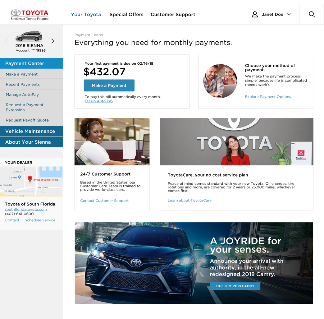
Website case study

The world’s largest independent distributor of Toyotas called upon Signal to audit and optimize their finance website to provide customers with an improved user experience for managing their vehicle leases and loans.
Their goals were to improve navigation and usability issues, and to personalize content based on where customers are in the life cycle.
In this new case study, you’ll learn about the steps our team took to enhance the customer experience (CX).
STEP 1:
PLANNING & RESEARCH
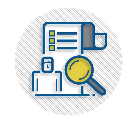
Our UX optimization approach typically follows a 4 step process, tailored based on client needs. With this project, our first step was to understand current website performance and identify opportunities using existing data and information. Evaluating basic website metrics and internal feedback is an efficient way to gain insight into the present state of affairs.
Put a measurement plan in place
Don’t forget to set your goals at the outset of the project. For a website, this may include things like fewer clicks, faster actions, reducing call center support or fixing reported usability issues. You’ll want to be able to measure improvements on these key metrics later.
We find that more companies are using an organic approach to UX optimization for their websites – meaning they replace full website redesign efforts (every few years) with continuous improvements to ensure the best possible customer experience.
Scrutinize website analytics
Your next step is to take a close look at your website analytics. It’s important to know which pages are getting views, so you can focus efforts on those that are most visited. As Forbes notes1, web analytics:
- Allow you to personalize things to frequent visitors’ distinct tastes
- Reveal what’s working – or not – from a UX / CX perspective
- Enable you to proactively fix site issues before they escalate
- Inform the customer journey – if you take time to use and listen to the data!
Analytics for our client revealed a couple of major action items. Their Home, Account Summary and Login pages carried 80% of the visitor traffic, and they needed UX attention. Analytics also revealed more mobile users than previously known – a critical point to keep in mind when redesigning web elements.
Investigate hot site search terms
We always recommend looking at search terms / keywords, because while some people use search as a primary means of navigation, most are using it because they are having trouble finding the information they need. The following top search words helped us prioritize certain information on the site:

TOP SITE SEARCH KEYWORDS
- statement, statements
- payment history, pay
- interest rate, refinance
- payoff
- extension
Listen to the call center
Employees who work in the client’s call center are on the front lines fielding customer questions – especially those that could be answered by an effective site structure and relevant content. CSRs told us there were a number of areas which needed to be built out on the website. Based on their feedback, we improved instructions and UI to ensure that customers:
- View the status of pending payments
- See their outstanding balance, payoff amount, due date and interest rate prominently featured
- Find an easy selection area for invoice preference (paper or paperless)
Look at customer survey data
Like website analytics, your customer survey data is another fertile source of information about pain points. Dig in and see if there’s anything relevant.
Cool tools for deeper dives
Heatmaps and recordings
helped us see users’ movement within key pages, giving us a more accurate idea about engagement.
Personas
allowed us to be mindful of users’ key characteristics and needs.
Customer journey maps
broke down the steps and phases, so that we could clearly see pain points and capture ideas for improvements.
GET THE DETAILS on these methods in our UX Demystified white paper
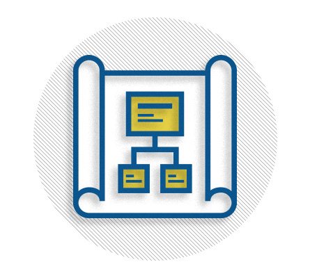
STEP 2:
INFORMATION ARCHITECTURE
If you’ve ever gotten lost, you know about the importance of having a good map to steer you right! The concept extends to the sometimes twisting, turning paths of website navigation. As the Nielsen Norman Group (NNG) points out2:
“Structure and navigation must support each other and integrate with search and across subsites. Complexity, inconsistency, hidden options, and clumsy UI mechanics prevent users from finding what they need.”
Audit website tasks and content
Our first step in thinking about information architecture – that is, the organization and labeling of website information – was to conduct a thorough audit of the client’s current site. This allowed us to create a comprehensive catalog of content and user tasks, segmented by stages of the customer lifecycle.
| Action / content | Onboarding | 1 – 3 months | 3 – 12 months | 12+ months |
|---|---|---|---|---|
| Register for an account | X | |||
| Learn about my vehicle’s features | X | |||
| View my balance | X | X | X | |
| New lease rates | X | X | ||
| Monthly service coupons | X | X | X | |
| New vehicle offers | X | |||
| View my payoff | X |
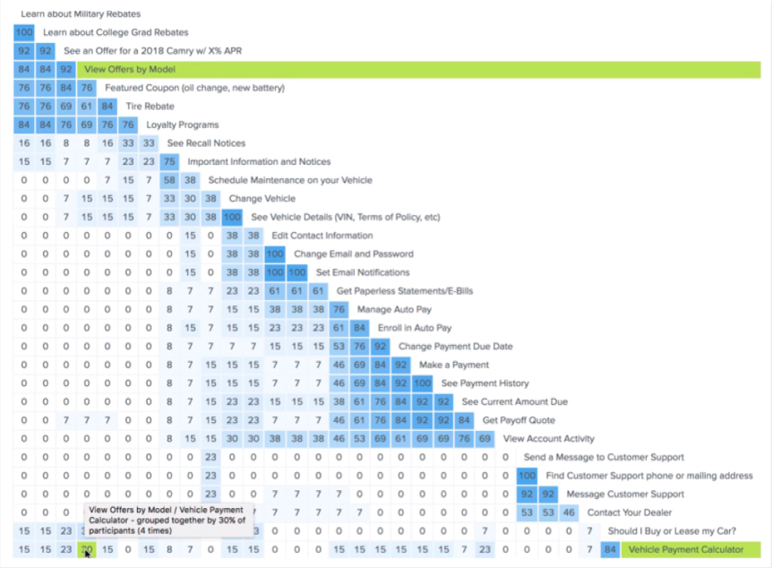
Use card sorting to optimize information architecture
Using the information gleaned in the audit, we conducted open and closed card sorting sessions with 25 users on a digital platform called Optimal Workshop. Card sorting is an easy UX research method that allows users to categorize content and tasks – as well as to develop intuitive navigation labels. The chart below answers3 some of the questions you may have.
| When is card sorting helpful? |
|
| How do you do card sorting? |
|
| What is the difference between “open” and “closed” card sort testing? |
|
Develop a new site map
The Signal team combined all the feedback from user research along with IA best practices and testing to create the final site architecture, removing redundancy and making paths more relevant and intuitive to the tasks at hand.
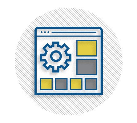
STEP 3:
USER INTERFACE
Usability.gov defines user interface (UI) as a focus on “anticipating what users might need to do and ensuring that the interface has elements that are easy to access, understand, and use to facilitate those actions.”4
Based on our findings from research and testing, we worked with a number of methods to show our client the new user flow, functionality and layouts.
Wireframes: a quick and cost-effective way to prove concepts
These low-fidelity iterations connected the information architecture we created to its visual design, helping us:
- Prioritize content
- Allocate space to given items
- Decide where to locate items
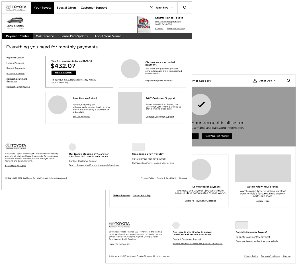
Clickable prototypes: conveying intended functionality in the interface
Don’t build it – “fake it” first! Both wireframes and prototypes are mockups of the proposed site or application, but we recommend prototyping to experience functionality. The clickable site prototype gave us something to test, so we could work iterations faster than with fully functional code.
Higher fidelity mockup: the final step before the site build
Finally, we applied styles and branding to give users a preview of what the site would look like. The goal: improve design first before moving into (potentially) more time-consuming coding and development.
Agile development
At Signal, we operate from a place of “customer first.” And for us, that means thinking about what’s important to the end customer – our clients’ clients. This is a cornerstone of the Agile methodology, an iterative design process that aims to get the work into the hands of the customer as early and often as possible. It can be applied to any project, from websites and marketing communications to digital apps.
Learn how we do Agile at Signal!
STEP 4:
TESTING & OPTIMIZATION
Conduct user testing
The last step of the process is to test the new design with real website users to ensure optimal UX / CX. User testing doesn’t have to be as daunting – and expensive – as the traditional focus group in a lab environment. There are many digital platforms to help recruit volunteers and conduct tests. We chose Usertesting.com, a site that uses crowdsourced testers who are ready and waiting. You can even define your target attributes such as age or gender.
For our client, we assembled 10 tester volunteers for “think aloud” user testing, using Usertesting.com’s easy online platform. (For the user experience design geeks out there, “think aloud” testing is one type of remote unmoderated usability study.5)
“A remote unmoderated usability study is when participants complete pre-determined activities using a design or interface. The participant decides when and where they would like to complete the study, and uses an online tool to participate, provide feedback, and record the session.”
The male and female testers ranged in age from 18 – 65 and were average computer users. We tested the client’s current design against our new design, using simple tasks such as “Find your payment history” or “Change your user/password.” Listening to real users narrate their way through web pages was incredibly valuable.
- “Hey, it’s not popping out at me…” [OLD DESIGN]
- “I’m confused about vehicle vs. account maintenance…” [OLD DESIGN]
- “Yes, this is where I want to go…” [NEW DESIGN]
Listen to a few clips from the live user testing sessions.
The UX experts at NNG call think aloud testing the #1 usability tool, and for good reason. The benefits include6 being:
- Cheap, because you don’t need special equipment to gather insights
- Robust, because it’s easy to get good findings (without a lot of statistical expertise)
- Flexible, because you can use it any stage of development
- Convincing, because clients love direct insight into how their customers think and act
Results
- Improved “time to task”
- Validated label names
- Prioritized better navigation and page layout
- Tone and attitude changes from frustration to confidence from old to new design
Improved key metrics from the measurement plan put in place at the beginning of the process
Final thoughts
User-centered design principles can improve the overall customer journey, which helps you:
- Better compete in the marketplace
- Turn happy customers into repeat customers
- Shorten the customer lifecycle
The UX / CX process we outlined in this case study can be scaled to fit your needs. The deeper you go, the more you can uncover and fix.
Signal’s multi-disciplinary team of writers, designers, strategists and technologists won’t lean towards a one-size-fits-all solution – we’ll craft one just for you.
References:
- https://www.forbes.com/sites/danielnewman/2017/04/04/improving-customer-experience-through-customer-data/#e020a8a4e64d
- https://www.nngroup.com/articles/top-10-ia-mistakes/
- https://uxplanet.org/improving-information-architecture-through-card-sorting-730a66b7bdda
- https://www.usability.gov/what-and-why/user-interface-design.html
- https://help.usertesting.com/hc/en-us/articles/115003379332-Remote-unmoderated-usability-study