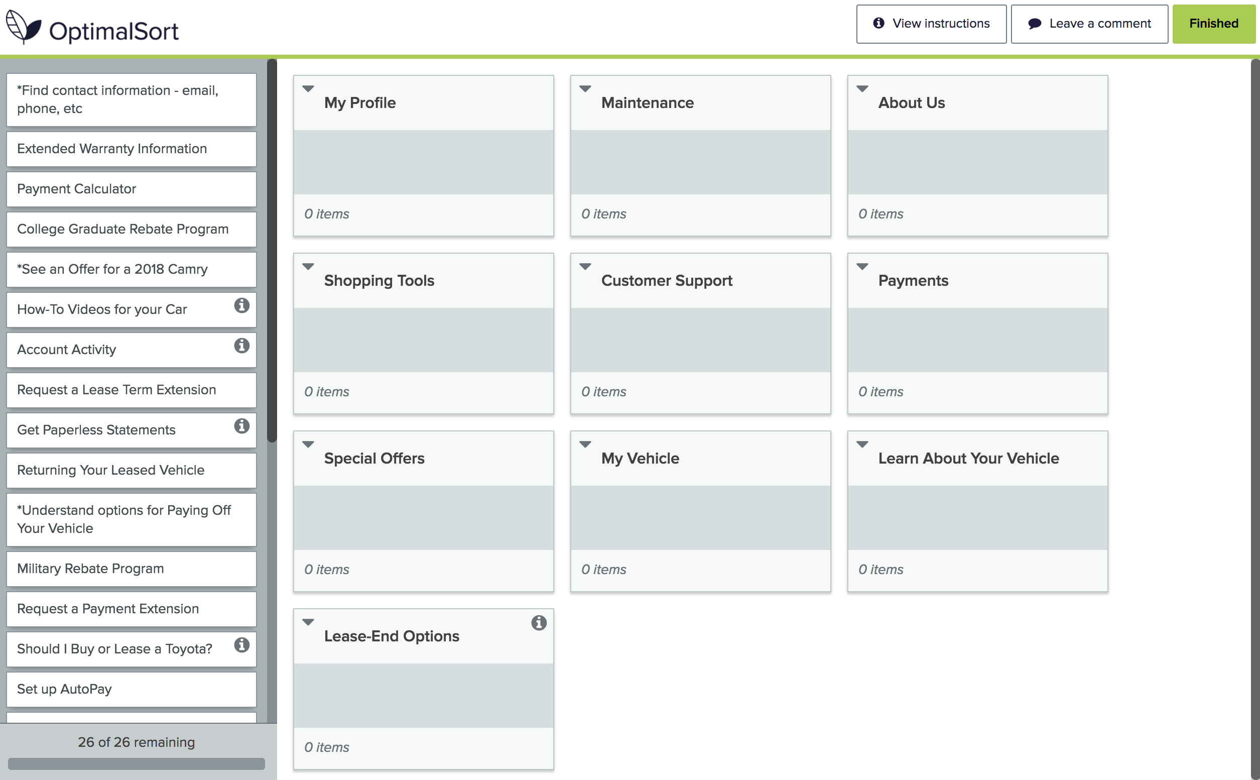
The structural design of your website – AKA informational architecture – is critical to UX optimization. Visitors who can’t find what they need while navigating will become frustrated – or even worse, abandon your site altogether! Card sorting is an easy UX research method that helps you design a user-centered site that increases usability and delivers a positive customer experience.
What is card sorting?
Card sorting allows users to categorize content and tasks – as well as to develop intuitive navigation labels. This time-saving step helps you create clarity before moving to site design.
What data do I need?
The first step is to conduct an information audit of your website to understand how things are organized and labeled. Look at things like website analytics, hot search terms and customer survey data. Consider creating a spreadsheet of content and user tasks – what do users need to know and do?
How do you actually do card sorting?
Simple – just write down the elements you want to categorize on cards or sticky notes, and have session participants sort them into groups that make sense to them.
Another option is to use a digital platform such as Optimal Workshop, which gives you the flexibility to run quick research remotely.
When is it helpful?
- To find out how users expect to see information on a website
- To organize a sitemap
- To organize submenus
- To classify products or services
What are “open” and “closed” card sorting?
- With open card sorting, users can create their own categories or add missing information. This helps you categorize and prioritize tasks/content and label groups.
- Closed card sorting limits participants to a set batch of cards, and defines the available groups or categories to put the cards into. Volunteers can’t create their own groups and tasks – they’ve got to stick to what you’ve given them. The goal is to optimize and confirm your chosen navigation categories and labels.
What do I do with the card sorting data?
Use it to create your final information architecture, one that’s more intuitive – and relevant to your audience. Now you’ll be set to proceed to creating the user interface – the flow, functionality and actual website layout.
Contact Signal to help you plan and execute UX research to ensure the best possible customer experience.


