
A great website is an experience. It strongly influences how you feel about a company or product and can move you to make contact – or make a purchase. At Signal, we’re always keeping an eye on the latest in web design that helps our clients stand out online. These are the cool new trends we’d like you to know about now.
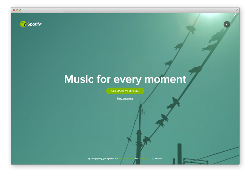
- Video backgrounds: similar to large imagery, using video backgrounds on a website brings your message to life in a big way. Nothing else has the sheer impact of a video background, which provides inspiration and captures the essence of your brand – without words. Two examples we love: Spotify and this Eastpak microsite.
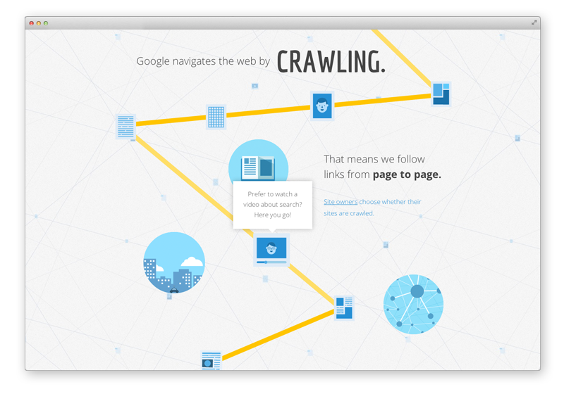
- Interactive infographics: Infographics are visual representations of information, data or knowledge. Interactive infographics have features that allow a visitor to explore the data, offering more detail on mouseover, panning or zooming or different views. This technique is well-suited for timelines, evolving data or multiple categories. It also is a great way to tell a story, like Google’s How Search Works.
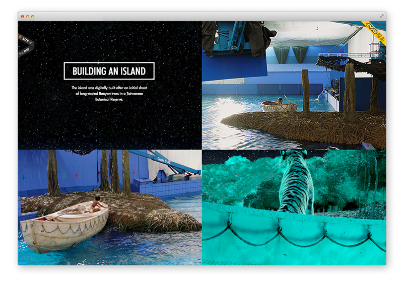
- Parallax scrolling: with this design technique, background and foreground layers move at different speeds, taking the visitor on a 3D journey – in a two-dimensional browser window. Why it’s effective: Technologies such as HTML5 and CSS3 make it possible to create impressive, memorable stories. This awesome website traces the making of the movie Life of Pi.

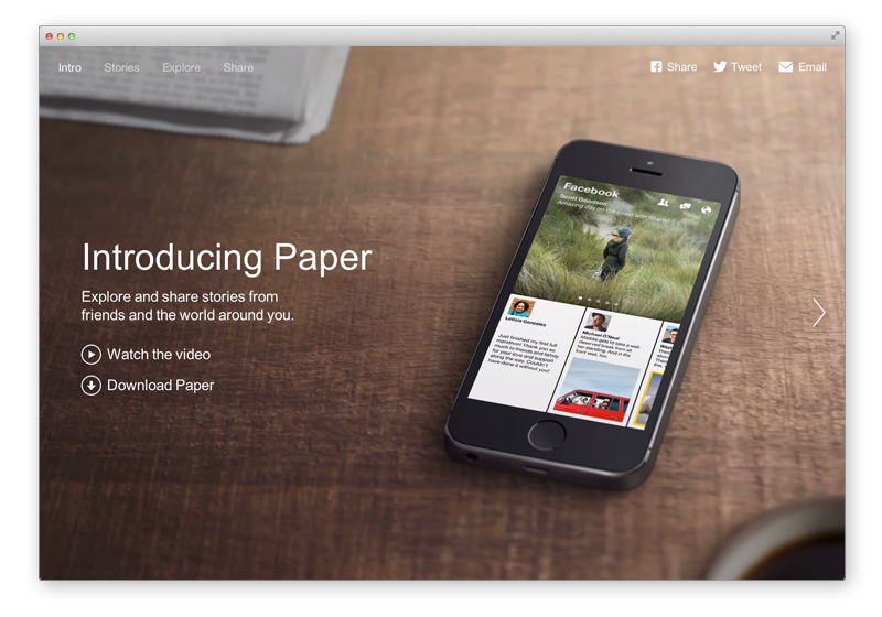
- Large images: large photos or graphics are fast replacing sliders in the “hero” area at the top of a website, like Facebook’s new Paper page. And large imagery is so effective at capturing attention that some companies aren’t just jazzing up the hero area – they’re filling the entire browser window, like the Roux at Parliament Square restaurant or the Harrison Grierson construction company. The images are the message.
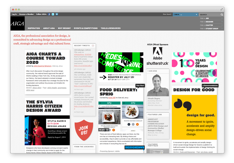
- The print magazine look: Magazine-style web designs take a page from the print world, taking a trend from content marketing to turn your product or brand into a full experience – complete with bylined articles, sections and stunning photos. This design style is a natural for the web versions of print magazines such as The New Yorker. But it also translates well in other instances, such as this magazine-style page for AIGA, the professional association for design. Creating a magazine-style website is no small design and programming task but it gives your online presence some serious weight in the cool category.
- Iconography: using icons to communicate key information quickly. Recognizable icons help visitors navigate, process information and locate calls-to-action. Icons are great for providing visual interest and reducing the words on the page for a simple, attractive look. And people are very familiar with icons from widespread use. Iconography is also great for drawing attention to products, services, menus or features – and for use in graphics, diagrams or supporting calls to action.
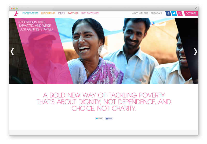
- Fixed navigation: the main benefit of the fixed (or “sticky”) navigation bar is ease of access to core content. No more scrolling to the top required – the fixed navigation bar lets the visitor move about the website, regardless of where they are on a page. It’s fast and it’s popular. The non-profit Acumen has a nice fixed navigation bar (and cool, interactive parallax scrolling effects, too).