When you only have a few short moments to capture someone’s attention, try an infographic.
![]()
Infographics can be found everywhere. The basic technique is nothing new – maps, charts, and graphs have long been used to visually capture information in media, for everything from weather forecasts and transit diagrams, to features in newspapers like USA Today.
But information overload and the proliferation of simple design tools make now an especially fertile time for infographics. There’s a widespread need for information nuggets that are insightful, easy to grasp and share, and suited to our fast-moving digital world.
Critics and trend-watchers talk about “infographics fatigue,” arguing that the trend is dead and no longer of value. However, we see infographics as a tool that can be used well or used poorly. They are only as effective as the data, design, and story put into them. This paper is a field guide to the fundamentals of infographics, the different ways they can be used, common mistakes to avoid, and keys to success.
Infographics are only as effective as the data, design, and story put into them.
THE BASICS:
What are infographics?
The terms infographics, information design, and data visualization are loosely defined and generally refer to the same thing: information presented in a graphical form. These terms can be considered to have slightly different shades of meaning:1
- Infographics, literally information plus graphics, are visual representations of information, data, or knowledge. They present complex information quickly and clearly – and often, tell a story.
- Information design is the practice of presenting information to foster understanding, often taught in graphic design courses.
- Data visualization is the study of visual representation of data – i.e. using graphics to make sense of large amounts of data or information, especially in science and academics.
First, start with the building blocks
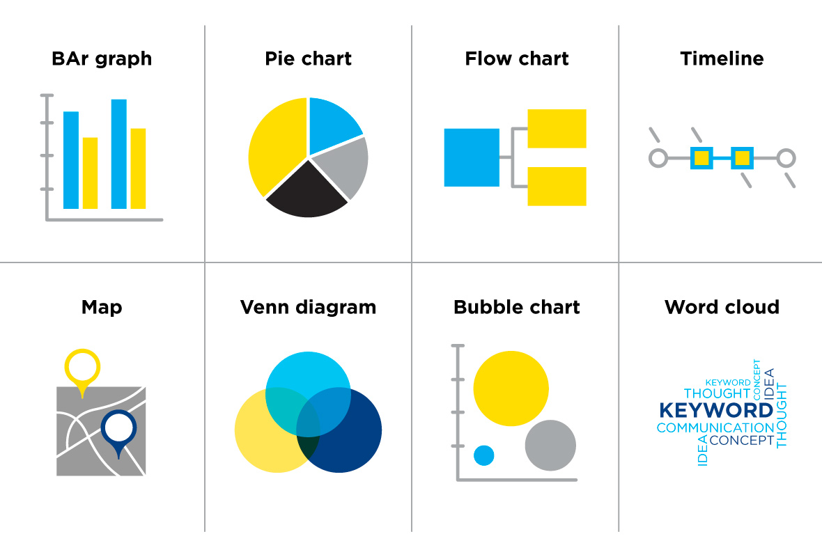
On their own, each one of these familiar building blocks could be considered a simple infographic. The complex infographics we routinely see today often use them as components – much like a complex molecule is made up of a number of chemical elements.
Using infographics – presenting information, telling a story
Content marketing expert Joe Chernov praises the power of infographics in an era of “too much information and too little time.”3 Chernov recommends that communicators choose from four core types of infographics to help simplify the complex – as he discusses in a brief video.4
- The “state of” an industry/trend/idea: Share updates, celebrate milestones, paint a picture of change, show relationships, or set up calls to action.
- Educational resource: Create goodwill and sticky experiences with “how-to” resources and guides that may offer steps, diagrams, or do’s and don’ts.
- Compare / contrast: Provide education or stimulate discussion with comparative infographics (for example “Mac vs. PC” or “Geek vs. Hipster”).
- Evolution: Offer “food for thought” content that establishes authority, fosters debate – or helps you get more life out of existing content.
There are two more types of infographics we’d like to add to the list.
- Numbers and stats: The ever-popular figure-driven infographic, which focuses on numerical data, percentages, or survey responses. In place of spreadsheets or voluminous reports, a pithy summary infographic can make an immediate impact.
- The visualized article: An interesting format to tell a story, letting readers follow the flow in visual form. Re-imagine a traditional article visually, like this smart infographic from the Newspaper Association of America about why millennials still want newspapers.5 Storytelling through infographics is eye-catching, engaging and one of the most clever ways to make a powerful emotional connection with your audience.
Infographics can showcase data in a number of ways:2
- See relationships among data points (scatter plot, matrix chart, network diagram)
- Compare a set of values (bar chart, bubble chart)
- Track rises and falls over time (line graph, stack graph)
- See the parts of a whole (pie chart, map)
- Analyzing and diagramming a text (word cloud, word tree)
Why people like infographics
A recent article6 by marketing education and training organization MarketingProfs looks at why we like infographics. The article contends that effective infographics help us sort useful information from the volumes of unnecessary data we are faced with every day – in as little time as possible! – through “a well-thought-out combination of font sizes, colors and visual elements.” MarketingProfs also highlights our human propensity for visual learning and for wanting to see statistics and numbers as proof of expertise.
Mistakes to avoid
Not all infographics are brilliant masterpieces.
When they’re bad, infographics can be a total mess, failing to register with the audience you wish to influence or even backfiring to harm your reputation. But what makes an infographic bad? Here are some major pitfalls to bear in mind.
- Gratuitous infographics are done for the sake of doing an infographic when text or simple diagrams would work just as well. Added icons and symbols need to serve a purpose.
- Confusing infographics make your data or information harder to understand instead of easier – defeating the whole purpose of going visual.
- Overloaded graphics pack too much information together, fail to make a point, and risk losing the reader’s attention fast. Your audience may be left asking “So what?” It can be wise to split complex information into multiple pieces instead of cramming it all together.
- Bad design can wreck an infographic. This can be a matter of gaudy colors, ugly fonts and amateurish layouts, but it can also be professional-looking design where the information itself is mishandled. The designer might inadvertently distort the data to conform to a visual concept that looks nice but fails to represent the information correctly.
- Misleading infographics deliberately paint a false picture to promote an agenda or make an unfair marketing claim. For example, zooming in the scale on a bar graph in order to make a small difference between values seem much larger, or making “apples and oranges” comparisons. Such gimmicks risk creating a negative impression and suspicion among the audience.
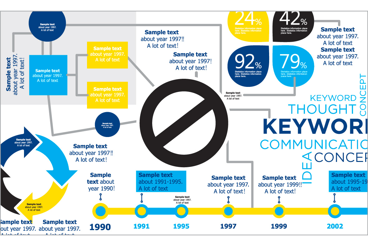
 Beware the Crap Circle!
Certain visual clichés crop up all too often in infographic form, and one of the biggest offenders is the circle-and-arrow cycle that has been branded as the “crap circle.” These diagrams are intended to show how a process flows in a loop, and they may look snappy enough. But they can lazily contrive a cyclical relationship that is either questionable or false. Harvard Business Review speaks out against the crap circle in this oft-cited blog post.7
Keys to success
Make it memorable
What makes an infographic great? New research shows that our minds unconsciously receive a surprising amount of visual detail in just an instant. So an infographic’s memorability can enhance its effectiveness. The recent article “The Secrets of a Memorable Infographic”8 looks at this connection, based on the more than 2,000 images that made up the largest scale visualization study to date. This is what the study found about memorability:
- Recognize it and remember it. Many infographics contain “human recognizable objects” that we see in everyday life – photos, body parts, icons, animals, or foods. With good reason, because these images make for the most memorable visualizations.
- Colorful is better. Researchers found that infographics using more than six colors were more memorable than those with few colors or those in black and white.
- We like to see a lot going on. Visual density or “clutter” is often frowned upon, but done right it can actually boost memorability. Complex infographics showed an advantage over more minimalist visuals. And rounded shapes were an added bonus, increasing memorability.
- Bar charts are a no-go. Surprisingly, basic bar charts and graphs suffer from overexposure. We have a hard time distinguishing one bar chart from another.
And tie it to strategy
Memorability can be a powerful edge, but still an infographic is only as good as the data and strategy behind it. As with any other marketing communication, Signal recommends that it should be based on 9
- Good planning
- Thoughtful strategy
- A solid understanding of your audience
- Strong, aligned, approved messaging
- And accurate, meaningful data and information.
With these things covered, we find that an infographic serves as a great piece of snackable content: bite-sized and designed for easy consumption.
Final Thoughts
Creating memorable infographics that are aligned with your strategy may mean the difference between your communication moving customers to action – or getting lost in the fray. Joe Chernov tells how he was so impressed with an infographic on which fish are safe to eat that he carried it in his wallet, consulting it at restaurants. Now that’s an effective infographic!
The ultimate measure of an infographic’s success is retention – how well it teaches new information that the audience retains long-term.
At the end of the day, our best advice is to be thoughtful in the use of infographics. Don’t add a visual when words alone will do. Ask yourself these two simple questions when trying to decide between using an infographic and sticking with words to convey that critical message.
- Do you want to express nuggets of information that have a clear relationship between them?
- Can you find interesting visuals that will represent that relationship?
If you can answer yes to both questions, an infographic is a great solution.
We hope you’ve found this paper helpful as you think about the best way to tell your organization’s stories. If you’d like to learn even more about infographics, content marketing, communication planning and more, please contact us!
References:
-
http://en.wikipedia.org/wiki/Infographics
-
https://wiki.carleton.edu/display/itskb/Types+of+InfoGraphics
-
http://www.prnewsonline.com/featured/2011/09/15/the-top-4-core-types-of-infographics/
-
http://www.youtube.com/watch?v=0mADN6kKMFQ
-
http://www.naa.org/millennials
-
http://www.marketingprofs.com/opinions/2013/24017/why-your-customers-heart-infographics
-
http://blogs.hbr.org/2013/03/its-time-to-retire-crap-circle/
-
http://www.fastcodesign.com/3021394/evidence/the-secrets-of-a-memorable-infographic
-
/new-research-on-memorable-infographics/