If your business is global, or operating in different regions of the US, you probably have access to large volumes of “geocoded” location data. This is any data that includes specific region, country, address, city, state or latitude / longitude coordinates. Creating digital maps out of your location data can bring robust trends and insights to life, helping to turn raw information into actionable business intelligence.
Business benefits
Whether in static or interactive formats, maps are the best way to visualize your location data, offering valuable information about what’s happening where (and how much). You can use maps to:
- Gain marketing intelligence – see where key competitors or customers are located
- Improve prospecting – target potential customers based on density of desired attributes
- Support sales pitches – showcase things like global expertise or staff density
Types of map-based data visualizations
Mapping frameworks available today are able to layer data from different sources to help tell a comprehensive story.
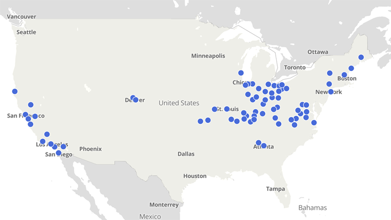
Dot maps represent simple objects in a given area.
When to use it: Dot maps can be used to present a general overview of elements distributed over a geographic region. For example, the dot map below could be showcasing office or customer locations.
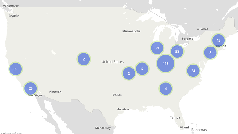
Bubble maps are similar to dot maps but show quantity as well as location.
When to use it: Bubble maps represent quantity and can be used when you need to show the difference in sizes of values. For example, the bubble map below could be pinpointing areas with higher concentrations of potential customers.
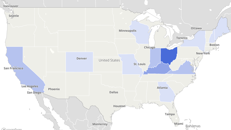
Choropleth maps display data in relation to a data variable.
When to use it: Choropleths can be used to visualize data ranges in a geographic region, to see patterns and variations in a desired attribute. For example, the choropleth map below could be examining purchase volume on a state-by-state basis.
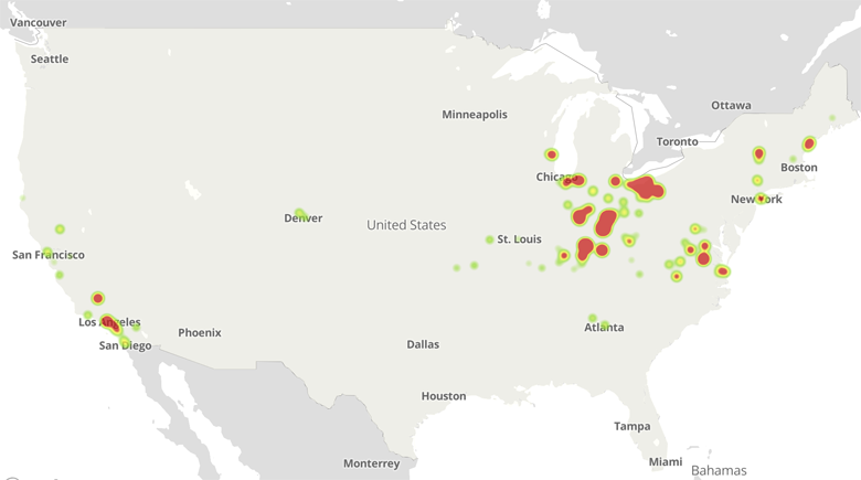
Heat maps use color to display density.
When to use it: Heatmaps use location trends to show density using a color gradient. For example, the heatmap below could help visualize the density of customer service representatives located throughout certain metro areas.
Mapping frameworks
There are countless mapping frameworks / platforms available today. These are just a handful to give you food for thought as you start your process.
- Google My Maps: Google Maps is a popular platform that overlays your provided data over map views, giving you options to build in interactive features. Check out this map from CAL FIRE that shows general locations of major fires burning in California.
- MapBox: MapBox helps you build professionally designed, smooth vector maps that can be customized to your project. This example was created to help a New York bike share system visualize and analyze where and when bicycles are transferred and bike availability patterns.
- Tableau: Tableau works with multiple data sources to create combined, interactive visuals. Click through this sample superstore dashboard to see an example of what can be done in Tableau.
Questions to ask before you choose a framework
- How much does it cost? Does it have a flexible pricing structure?
- Does it require an account or membership to use?
- What kind of customization options does it have?
- Is it easy to use? Is there support and/or training available?
Want to learn how to better leverage your location data? The Signal team is here to help.