Marketers are great at gathering data on customers: it’s an integral part of the job. But as Smashing Magazine says, “Data often fails to communicate the frustrations and experiences of customers. A story can do that, and one of the best storytelling tools in business is the customer journey map.” When you’re looking for a deeper level of insight into what makes your customer tick – especially from a user experience (UX) perspective – the customer experience map is the perfect tool.
Putting the customer front and center
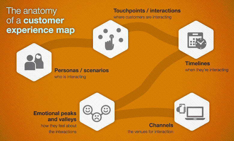
A customer experience map outlines the customer journey from the initial contact through the process of learning and engaging – and into long-term trusted relationship with a company. It identifies key touchpoints and the customer’s perceptions and questions during those touchpoints, which helps marketers convert data into a story to share and use throughout the organization to improve UX.
There is no set template for what a customer experience map looks like. The most important thing is to remember to include both analytical and anecdotal research for a robust representation of what the customer goes through.
Choosing a layout for your customer experience map
A customer experience map is basically a visual representation of a customer’s flow, their needs, wants, expectations, and overall experience as they navigate toward a particular goal. The right layout will depend mainly on the amount of content that results from your research, how simple or complex that information is, and where you want to place the most emphasis.
For more information on how to make sure your customers are having an exceptional experience with your website, check out our in-depth guide, UX Demystified!.